Showing posts with label lilla rogers studio school. Show all posts

Tuesday, May 27, 2014

MATS B wrap-up

I completed the 2nd part of the Make Art That Sells e-course a couple of weeks ago and without a doubt, it was 5 weeks packed with intensity mixed with fun. I had learned so much from part A and was able to apply a little bit to each assignment. My pieces overall were stronger and my computer skills were a little sharper. I would suggest that if you are planning to take this course and work traditionally, that you have a good working knowledge of Photoshop. I did not have much experience with PS in the first section last fall, and boy did I struggle! Lilla may touch on this as a prerequisite for the course, but I either missed it or did not realize how important PS is in making your art web-ready. Also, the turn-around on projects is uber-quick…mini assignment given on monday, main assignment on wednesday and due on sunday…remember to breath!!

Here we go,
week 1: the paper market (stationery, greeting cards, etc)
The assignment was to create a holiday card based on the theme gingerbread houses.


 I played around with a few color palettes and decided to go with the traditional holiday colors


I really enjoyed working on this piece and felt very comfortable completing it in clay. 


week 2: baby apparel market
The assignment was to create a collection based on a pirate theme, suitable for baby


I loved this one too….my joy is definitely creating images for kids and the young-at-heart. The icons were rendered in copic marker, watercolor, & pastel pencil and arranged and composed in PS.

week 3: the scrapbook market
The assignment was to create a set of icons with the theme "vintage correspondence"


As you can see, I deviated from the theme (the mini on this one was to draw vintage ink bottles and I just couldn't get fired up about it…and was totally pressed for time as my son was home form the Marines for the week)….anyhow, as it was Easter, I went for a "vintage Easter" feel….copics & microns, then composed in PS

week 4: editorial illustration
Assignment was to illustrate a map of our home town.


So a total labor-of-love with this one. I went with clay relief, and had a blast putting it together, aimed for a folk art feel with the colors and icon as both represent my town. 17+ hours of sculpting and composing left little time for photography. I would like to reshoot this one at some point. Here are some details.


 week 5: party paper market (paper plates, etc. suitable for holidays, birthdays, celebrations)
Assignment was to create a plate, napkin, and cup set influenced by Bavarian folk art.


Intended for a child's birthday, painted with acrylics and composed in PS. Enjoyed working on this piece….fun colors and subject matter. Lilla chose this piece along with a classmates' to illustrate pleasing color palette…it was nice to get an acknowledgment in the last week of the course!


Monday, February 24, 2014

The first MATS Bootcamp assignment

Wow! It was an adrenaline filled week for this bootcamper! Our assignment was to design a cell phone case with a cuckoo clock theme. We started off with a "mini" assignment of researching and sketching....you guessed it....cuckoo clocks! At this point we had no idea what the main assignment was, so the sketching was super relaxed and we had the freedom move in any direction with our sketching process. I didn't do a ton of sketching due to time constraints, but I did come up with a few icons that I liked.


I was partial to the traditional Bavarian-style clocks with their cute little animals and mushrooms, but I had come across some unconventional ones on Pinterest like a cuckoo clock teapot and crazy brite pink or teal clocks and was inspired to go with something completely whimsical.
After a few days of floundering about with markers, pencils, and paint, I turned to my old friend polymer clay. Here are some pictures of the process, which took 2 days of working  here and there in-between making pieces for orders from my Etsy shop and life (4 kids at home on feb vacation). Photographing and editing in photoshop took another full day and a half.


I went with a cupcake theme, made the sketch and then photocopied it to make some templates for the pieces of the clock which I cut out in clay….super soft sculpey III.

The challenging part was choosing the pallet. Lilla had given us 2 on-trend pallets that I liked, but I felt that neither of them would work for this piece, which I envisioned being totally candy-shoppe-lollipop-sugary-sweet.
I chose to work in my sunny kitchen instead of my studio, so that I could be at "command central" for the kids. I gathered up all my supplies and spread out on the table. Normally I work with colored clay that I mix, much like paint, to get shades and highlights, but I wanted more control with this pallet and opted to paint the clay after it was baked. I worked in layers and edited my original sketch as I went along, adding some elements and discarding others. I used super glue and hot glue to hold everything in place.
Time to photograph! I set it all up in my lightbox, arranging all of the candy swirls, hearts and sprinkles each time I changed the background color, which was at least 10 times!

I had fun taking some informal shots with my iPhone and documenting the progress on Instagram.
The next step was the most challenging as I am still in the infant stages of learning photoshop. This is the finished mock-up that I submitted to Lilla's gallery.


I really enjoyed this assignment and got some valuable feedback from my classmates (whose work blew me away)….you can view all of the submissions (about 350+ artists participated) on lilla Roger's
website tomorrow. I can't wait t see them all!
Thanks for checking out mine!


Thursday, November 21, 2013

Make Art That Sells wrap-up


It's hard to believe that 5 weeks of the MATS e-course has come to a close....2 weeks ago actually! It was an intense, emotional, motivating and exciting journey that I was so fortunate to experience. It has left my creative cup overflowing and given me a completely new approach (which I badly needed) to making art. i am not afraid to try new things, no longer am I stuck in my nice, neat little illustration box....I have broken free and it feels so good! Here is the rest of my journey, weeks 3-5.

week 3 Children's Book
Our "mini" on Monday was a 2-part assignment: 1. to draw lots of birds in our own style and then pick one to develop into a character and 2. to hand-letter the words "the language of the birds".

 I was really pressed for time this week and really never got to develop a strong bird character or do much lettering. I decided to just hold my breath for the main assignment in hopes that I could pull something together. On Wednesday we were instructed to incoorporate our bird character into a cover illustration or 2 page spread for a Russian folk tale called "The Language of the Birds". We did not have to stick to the storyline and do our piece in any medium. I decided to go with my watercolor-colored pencil style, which, in the end, was probably not the best choice as it is so time consuming. There were alot of late nights that week! I had opted to keep my Etsy shop open throughout the course and it was a quite a juggling act to balance the etsy orders with the assignments. I ended up working early mornings and late nights on the course assignments, but for this week, that was just not enough time. I came up with some ideas for the cover and quickly picked one to develop. I knew the bulk of my time would be spent rendering the finish, and really did not spend enough time on the sketching/plannning stage.


I had to make some changes on the final that were not easy to make given the meduim. I gave it my best shot with the time I had, but definitely finished feeling disappointed with the final result. i wanted to go back and re-work it, but of course there was no time. Learned some good lessons though and figured out a little more photoshop stuff in the process of scanning and uploading.
week 4 Wall Art
Lilla informed us that this week would be "more relaxed" and a nice change of pace from the intensity of week 3. I think everyone in the class was a little relieved! On monday we were assigned 2 colors based on our zodiac sign and were instructed to go on a scavenger hunt for bits and pieces of paper, scraps, fabric, buttons, anything really in our colors + neutrals that could be glued down to a substrate. This was really fun.
My colors were green & yellow. I am a total hot pink girl, so I wasn't sure how I would feel about my colors, but as i started to see all of the shades and nuances, i really fell in love with them. Here's my all my loot!
So what were we going to do with all of our "stuff"? Our assignment was to create an piece of abstract wall art that should include organic/geometric shapes, some florals, and a few words. lilla showed us tons of gorgeous wall art to inspire and get us rolling....in all honesty, I had no clue where to start. Abstract was 100% out of my comfort zone and I wasn't too sure about getting messy.  I had to start somewhere, so I "practiced" being messy by painting a bunch of my own papers to collage. This was fun, but I had a need to return to the familiar, so I went to my clay table and made alot of little clay pieces that I later painted and used on the final piece. Feeling a bit more confident, I started to collage my painted papers and some of the tissue, scrapbook papers, fabric, stamps, etc....again, although it felt strange to be so arbitrary about it, it was definitely enjoyable. I was starting to "dig" it lol! I started off with two canvases and eventually chose one to focus on due to time constraints.
Messy was fun! I needed to be somewhat organized with the composition as it just made sense to my brain. I glued on my clay pieces, fabric,and buttons and then stamped, splattered, smeared til my heart was content! It was a wonderful journey that taught me that things do not have to be perfectly rendered. By the time I had finished, I knew I had a completely new set of tools in my toolbox!
~I had found my place~

week 5 Gift
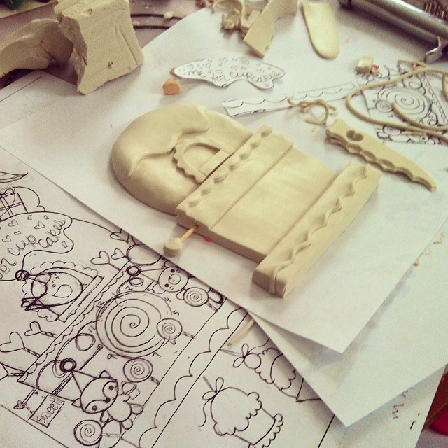
Here we were at the final week...the month seemed to pass in a total blur! We started the week by photographing out "collections". As I live in a house with 5 kids, 5 dogs & 2 cats, I have made it my mantra not to "collect" any extra stuff! I didn't really have much in the way of "collections" other than a huge box of dusty marathon/road race/triathlon medals....and clay stuff.....alot of clay stuff. I chose the clay! buttons, beads, charms, pendants.

The mini was to take pictures of our stuff and scan bits and pieces into the computer. Then we were to use these bits in the design of a "hyper-lush" pouch for the gift market. "Hyper-lush" is a trending style that involves lots of photo-realistic florals, icons, etc. 
The project could be done by hand (drawing the icons and collaging them), but really called for many hours in photoshop (at least many hours for me!) to produce a really nice result. I decided that this was not something I could really tackle in the time alotted, given my limited ps skills, and chose to go in a different direction. I did use one of my charms as inspiration for the piece, can you guess which one?
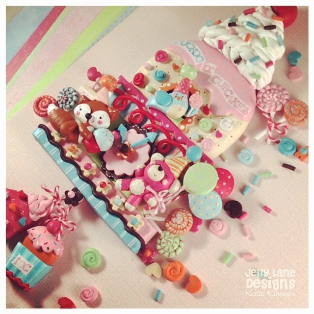
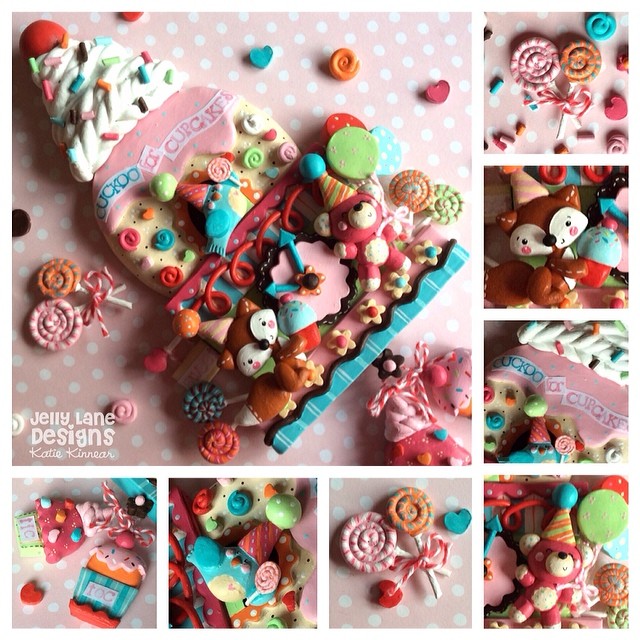
 I had such an enjoyable experience with the wall art assignemnt and chose to go back to that mixed media style to make a holiday card. I used lots of different materials and really enjoyed the process.
Here is the finished piece, now hanging in my daughter's room, as she is the kitty lover in our house!


To sum up the last month in one word.....Amazing! Lilla provided us with so so much information, expertise, inspiration, and kindness. She created a supportive environment in which we could experiment and grow without judgement. The facebook forum provided a place for comraderie, sharing, and wonderful feedback. My classmates were a group of incredibly talented artists always ready to offer help, support, a shoulder to lean on, and cyber hugs. I am looking so forward to the part B next spring, and over the next 6 months I will be delighting in exploring the new tools in my toolbox! Thankyou Lilla Rogers and the entire MATS team!


Monday, October 21, 2013

Coming up for air !! MATS roundup - weeks 1&2


Wow! Its been a whirl-wind 2 weeks and the adrenaline and excitement is still building. Today marks the start of week 3, the childrens book market, and definitely the place where I feel most at home, but this class is really about being outside your comfort zone. One major challenge I have had is my lack of experience with Photoshop. I have been tinkering around with it for a while, but my skills are really minimal....next class on my list is definitely a Photoshop 101!

 The turn-around on assignements is very quick. We get a mini assignment on monday and the main project on wednesday with a dead line of sunday. This is crazy fast when you throw life, work, kids, commitments into the mix, and I find that I am working all day saturday and sunday and submitting my work at the very last second....but I am doing it! I seem to go through a huge range of emotions throughout the week...overwhelmed, indesicion, inspired, joy, frustration, second-guessing myself, confidence, not confident, exhaustion, elation. Sunday night after I have submitted my pieces if feel a little like I have been run over by a bus, or maybe its more feeling like I have gone through labor and delivery, but Monday morning I am up early and ready for more! The calliber of work from my classmates is really top notch and I am inspired beyond words and learning so much from our little MATS community.

Week 1 Bolt Fabric
The mini assignemnt was to draw lots of vintage pyrex and berries. Off to Pinterest I went for some inspiration. Drew lots and lots in prep for the main assignement which was to create a design for vintage fabric.

From here we were instructed to choose some icons and build a theme around them for our fabric. I went with a recipe for nana's berry tart as my focus and created some icons to go with it. Lots of sketching, cutting, rearranging to get the composition.

I chose a color pallet and did the finish with copics and prismacolor pencils, adding some white and black linework in.


More time would have been ideal to tweak some things, but off to the scanner it went. I had some issues with the color getting dulled out in the final presentation, but this was due to lack of experience in photoshop. I use it all the time to edit photos of my clay work and dont usually have a problem, but a scanned image is different....so working to resolve that in my future submissions.

Week 2 Home Decor
Week 2's mini was to draw bromeliads (tropical plants related to the pineapple family)....at first, this one didn't grab me. I decided to go right to color, seeing these plants were bright and tropical, and did a page of plants with inktense pencils. This was just free and fun, something that I had not felt in a long time when approaching a project. I wanted to do more, but there were dishes and laundry and clay orders....
Lilla sent the big assigment a day or so later, which was to create a set of 2-4 plates (similar to what you would find at Crate&Barrel or Anthropologie). I moped feeling uninspired and unmotivated. After all my bag is creating cute, fuzzy animals and critters, all confetti and cupcakes....right? But i loooked at my plant sketches and remembered that I had fun doing them, so I had a little pep-talk with myself and finally dug in. 
This week was a challenge for alot of us, as reflected in many of the facebook comments. Everyone seemed to go through some awkward stages with their pieces, but in the end, came up with some gorgeous work. I guess without growing pains there is no growth.
I found a pallet that I really liked, bright and tropical like the plants and got inspired to make it work. I designed my plates for kids, in a fun, doodly style with some turtles and a variety of flowers and plants. 
I used watercolor and white gelly roll.

One of my goals with this class is to come out of it with a little bit looser style, that can adapt to different mediums. I am a nit-picker, detail freek, and in the past, would use colored pencils exclusively to meticulously cover every square inch of the paper. I am a work-in-progress, slowly coming out of the colored pencil-coma....and I like it!

design for large plate

small plate

The complete set....colors a little brighter than the first week's finish. I wish I had more time to play around with the placement and design of the presentation, but I was down to minutes before the deadline. I hope to learn a bit more in photoshop this week and apply it to week 3's finished assignment.....which is to create a bird character, starting with a couple pages of bird sketches. Pencil and scketchbook in hand as I head off to my daughter's field hockey game!

10/22/2013  Lilla's review
During the review of our home dec pieces today, Lilla gave us some great feedback on creating a background that would enhance the tone of our plates, and suggested that we go back and rework them if possible.  She also advised that the plates should not "tell a story"....save that for week 3, children's book! I omitted the 2nd plate as it clearly is narrative (hopefully will go back and create a new plate to compliment my main one, but not this week!), and just focused on the larger plate. Watched alot of tutorials and picked up some skills in photoshop, and was able to create a new backgound for my plate. Feeling a little better about it now.